National Geographic Media Kit Redesign
Editorial Design · Brand Consistency · Visual Systems
National Geographic commissioned a full redesign of its media information kits for both National Geographic Magazine and National Geographic Kids, with a focus on maintaining strong brand alignment across both properties.
For the flagship magazine, the design approach centered on preserving established brand elements—refined typography, curated photography, and a clean layout system—while introducing uniform iconography to clearly organize key data points.
The National Geographic Kids media kit followed a similar structure, but with an added emphasis on playfulness and approachability. Using a kid-friendly color palette and energetic layouts, the design balanced visual charm with the clear delivery of important marketing data, staying true to the tone and mission of Nat Geo Kids.


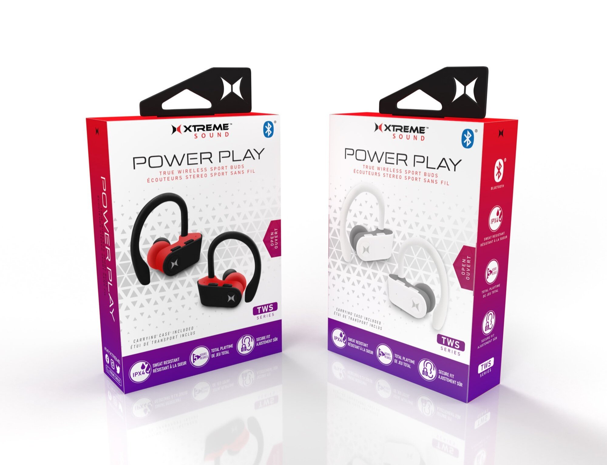
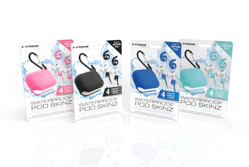
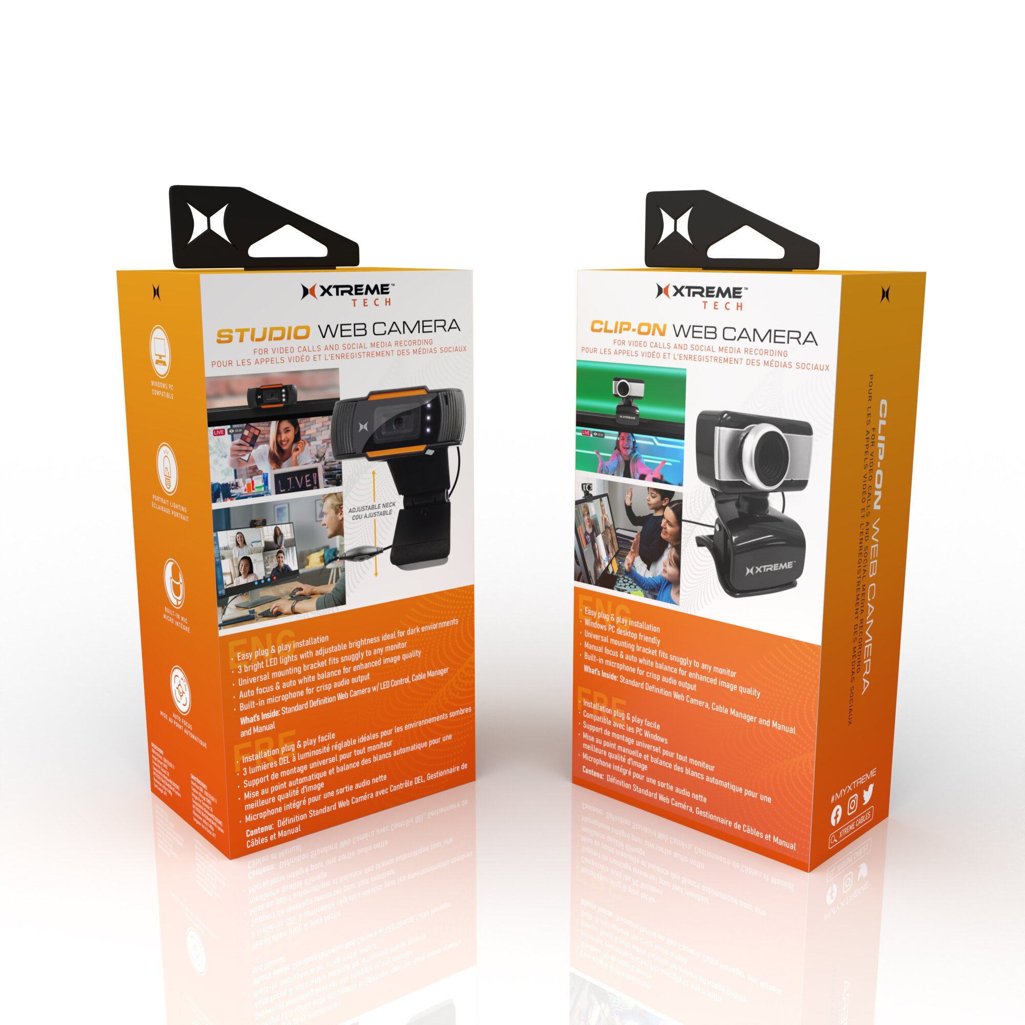
Xtreme Electronics Accessories Packaging Design
Packaging Design · Style Guide Creation · Brand Update
In 2020, I developed a new style guide for the Xtreme Electronics Accessories line with the goal of giving the brand a much-needed visual refresh. The updated packaging system was designed to stand out on shelves while staying cohesive across a wide range of products.
The new look features vibrant, energetic color palettes, clean and thoughtfully designed icons, and modern typefaces that bring clarity and consistency to the line. Every design decision—from layout to iconography—was made to enhance usability and shelf appeal, while positioning Xtreme as a bold, accessible, and tech-savvy brand.
This refreshed system was rolled out across new product launches and continues to define the visual identity of the Xtreme Accessories packaging line.


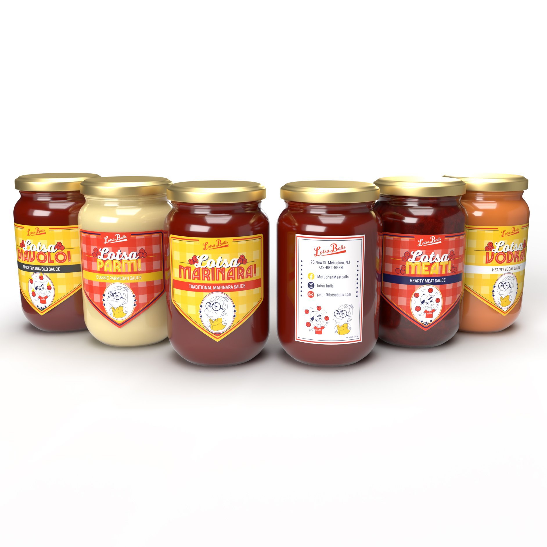
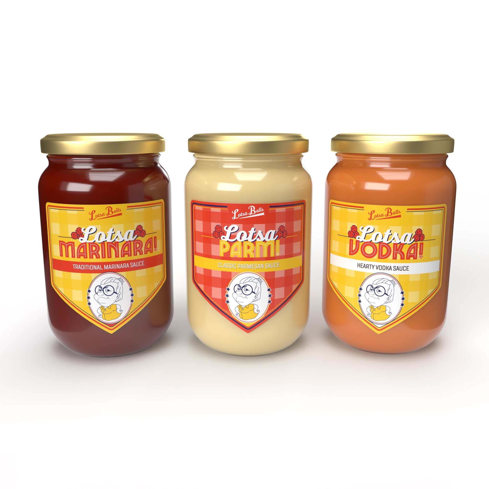
Lotsa Balls Sauce Label Design
Packaging Design · Brand Consistency · Print Design
I designed a series of labels for Lotsa Balls, a beloved restaurant in Metuchen, NJ, to support the launch of their signature marinara sauces sold in-store.
The project included five unique sauce varieties, each with its own personality while staying true to the restaurant’s bold, playful brand identity. The front labels were carefully curated with vibrant colors and type treatments that reflected the flavor and charm of the brand, while the back label was designed as a uniform template across all products to ensure consistency and efficiency in production.
The final designs brought shelf-ready appeal to a local favorite, allowing the brand’s voice to extend beyond the restaurant and into customers’ homes.